Extracting as much detail out of your map data is what your users want, and our new popup customizer allows you to generate charts to facilitate that goal.
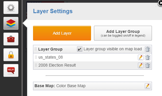
To add bar and line charts using map attribute data, navigate to the Layer Panel, edit the layer that contains data you wish to chart and go to the Popup tab.
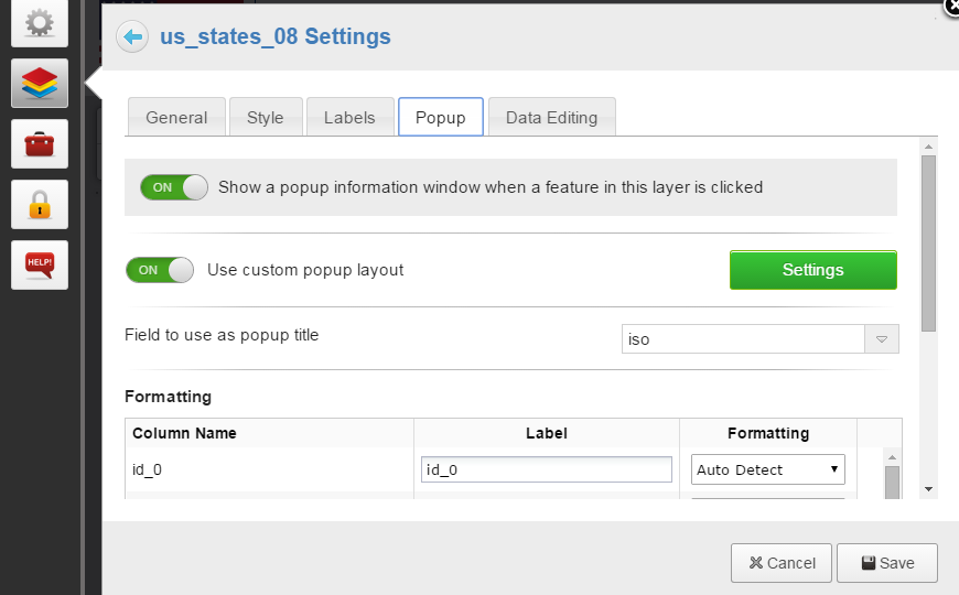
From the popup tab, enable custom popups and open the editor.
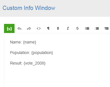
By default, all attributes are included in the popup with no formatting.
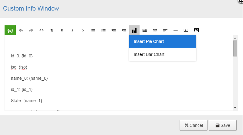
Click on the insert chart button and choose your chart type.
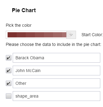
In the chart editor, select which values you want to chart by ticking the boxes. You can change the order of values by dragging them by the arrows icon. Once you’re happy with your order and variables, click insert.
The chart only renders on the map interface, not in the editor, so you will see a chart placeholder instead of your chart.