Creating visually compelling webmaps shouldn’t be rocket science. In fact, we think it should be mandatory.
Here at Mango, our number one priority is making web map creation accessible. We know creating and sharing web maps should be easier, quicker, more intuitive, and webmaps should look as good as the data is useful. We made Mango to do just that, and you’re map’s audience expects the same: easy to dive deep into geospatial data as well as being easy on the eye.
We’ve developed the map editor to allow you to completely customize your map – from your data attributes and tools right through to the map user interface, so you can share your style, and language or terminology, along with your map’s data.
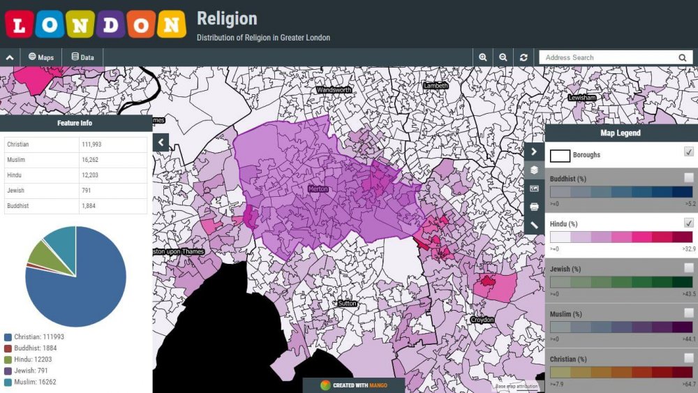
The default Mango interface features an unobtrusive neutral palette, and is ripe for customization. Whether it’s for brand alignment so your embedded maps integrate seamlessly into your website, or purely aesthetic to make your maps look great, customizing the map interface should be considered before sharing your map.
Branding
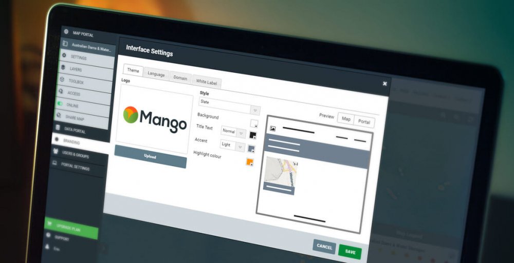
Your logo is on your business card, your website, maybe even on your car. Why isn’t it on your maps? Make sure your map users know who created the map – whether it’s your own organisation, or a collaborative map across agencies, putting your logo on your map is as simple as opening the Branding settings, uploading your logo in .jpg or .png format and clicking save.

Tie it all together: Color
Cartography in the digital age is the meeting of geographic information and aesthetics. Its never been easier to produce complex datasets and visualize them on a map, but not all of us paid attention in art class. Producing an aesthically pleasing map with Mango is simpler than it sounds, just focus on the story you want your data to tell.
Most geospatial data is visually complex, so keep the interface simple:
- Isolate and emphasize the information you want the user to spend the most time interacting with
- Use bold colors with strong contrast for your data attributes to focus attention on your data
- A small palette of 2-3 complementary colors and an accent color will tie the interface together, and minimize distraction
If you’re using custom navigation, ensure they’re discoverable by using an accent color
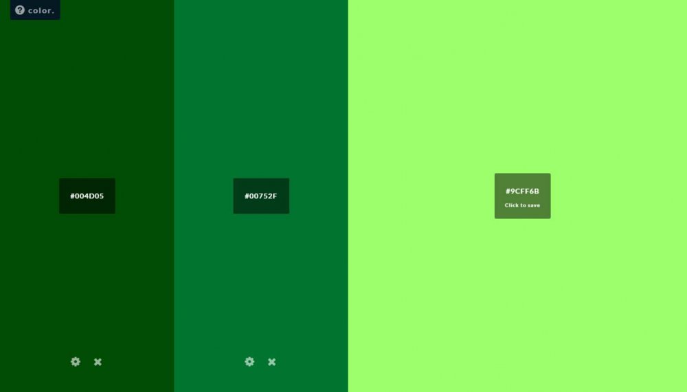
Here are some resources to help you choose great colors for your map. Just grab the hex color code that looks like this: #FE6500 and paste it into your branding settings.
- uipalette.net a one stop shop for color palette, agreggating the best color resources available online today including Color Hunt, Hail Pixel and more.
- paletton.com a powerful color wheel to discover great color combinations.
- flatuicolorpicker.com a modern palette picker with a simple interface.
- color.adobe.com another powerful color wheel for creating color palettes, and even allows you to upload your own images to find your perfect custom color palette.

Hail Pixel's color explorer
Layout & Custom Sidebar Content
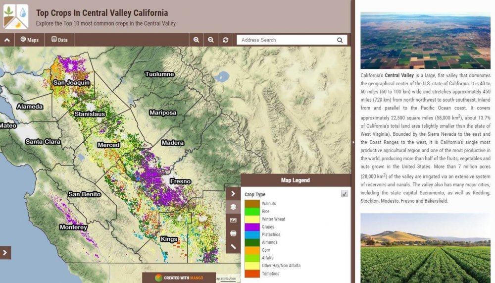
The layout panel lets you position your map title, navigation, and custom content to inform users and best communicate the story behind your data.
A top bar approach allows for unobtrusive layout with a brief description and logo, but our sidebars offer more real estate for an in-depth multimedia experience. You can provide background information for your data, map usage instructions, or even embed images or video to engage users. The side bar comes in 3 sizes: small, medium, and large, and slides closed at a click to reveal your fullscreen map.

Make the Map Yours
For a complete white label solution, Mango’s Agency plan allows you to completely disable Mango branding from the end user interface. Your end user’s will never know they’re looking at a Mango – it’ll be your custom domain in the address bar, no “Created with Mango” badges – all the end user will see is your branding.