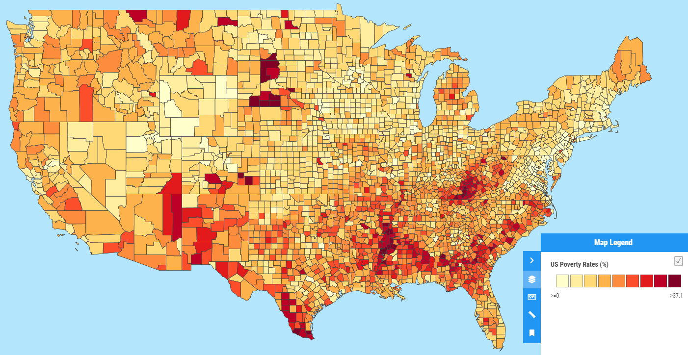
Also known as a choropleth map, the quantity style shows features coloured proportionally based on a numerical attribute value.
Quantity layer styling allows you to create a choropleth map in which areas are shaded in proportion to the measurement of the numerical attribute value of the feature being displayed on the map, such as population density or per-capita income.

Configuring quantity style
As quantity style is based on numerical attributes, the style will only work with layers that contain number columns.

Setting Class Breaks
Column
The column dropdown contains the name of each numerical column in the dataset's attribute table. Select the column that contains the data you want to visualize as a quantity map.
Number
This is the number of class breaks that will be used, you can choose between three and nine. This determines how many distinct 'bins' the values will be divided into.
Mode
This is the algorithm used to calculate the breaks, or the value 'range' of each bin. The mode you select can radically change the visualisation.
You can select from Equal Interval, Jenks, Quantile and Head/Tail breaks. You can also manually set the values yourself (see Custom Legend below).
Class break modes explained
These examples show the same data (US poverty rates by County) using the different modes available in Mango. All use the same colour ramp and number of class breaks.
Equal interval
This method sets the value ranges in each category equal in size. The entire range of data values (max - min) is divided equally into however many categories have been chosen. Learn more

Jenks
This method seeks to reduce the variance within classes and maximise the variance between classes. This is done by seeking to minimise each class’s average deviation from the class mean, while maximising each class’s deviation from the means of the other groups. Learn more

Quantile
This method classifies data into a certain number of categories with an equal number of units in each category. Learn more

Head/Tail
This method divide things into a few large ones in the head (those above the average) and many small ones (those below the average) in the tail, and recursively continues the dividing process for the large ones (or the head) until the notion of far more small things than large ones has been violated. Learn more

Colour Ramp
The colour ramp is the range of colours that will be used to visualise the proportionality of each feature. Each class break will be assigned a from the ramp. You can select from the preset colour ramps from a set of predefined sequential, diverging or qualitative colour ramps.
Sequential schemes are suited to ordered data that progress from low to high.

Diverging schemes put equal emphasis on mid-range critical values and extremes at both ends of the data range.

Qualitative schemes do not imply magnitude differences between legend classes, and hues are used to create the primary visual differences between classes.

See Cynthia Brewer's excellent resource ColorBrewer for further information about the art and science of colour schemes.
If you wish to customise the colour of any categories in the legend then you can use the Custom Legend button (see below).
Fill / Outline Settings
The fill and outline settings will be applied to all features in the layer.
For more information about fill and outline settings please see the article on Basic Layer styling.
Custom Legend
The Custom Legend settings allow you more fine grained control over your quantity legend by manually setting the class breaks and labels of each break that will be displayed in the legend.
To select your own colours for each class break, open the Custom Legend panel and click on the colour icons to select your preferred colour.
The Range column allows you to set a custom value for the individual breaks, and the Label column allows you to customise the label that will be displayed in the legend.
In addition you can choose the Legend Type from use either a horizontal (default) or vertical legend. The horizontal legend will only display the first and last label on the legend, while the Vertical legends will display all labels. This is useful when using many class breaks, or for maps where it’s important for the user to be able to easily see the value label of each class break.

Removing classes
With a Custom Legend, it's possible to exclude a range of features from drawing on the map.
By default, the first break uses the lowest value in the dataset. In this case, zero. By setting the first break to >=10, we can exclude all features <=9 from drawing on the map.
The custom class breaks

The resulting visualisation

Note: The custom legend currently only allows you to set the fill colour for each class break. If you wish to customise the outline colour, do so first in the main quantity settings panel before setting your custom colours, or create your desired class breaks by saving the style, and then customise the style using the Custom SLD option.