A map is a way to visualise data that allows for rapid decision making, allowing the navigator to uncover answers from your data that may not be apparent by viewing the data in traditional forms, such as a spreadsheet or static chart.
In Mango, a map is a single web-accessible page featuring layers of data-driven geographic visualisations.
A map can contain any number of visualisation layers, and a single dataset you upload to Mango can be visualised any number of times on any number of maps to lay bare the insights hidden in the data.
Each map has a unique web URL that can be shared privately with only with the people you choose, or shared freely with the world. You can share a map just like you would anything online - email a link to colleagues, tweet about it, embed it in your website, even share a link to a specific feature or area in a map. You always have the power to decide who can see your maps.
Each plan level in Mango comes with a set quota of maps. You can create maps up to your quota limit, and you can duplicate, reuse, rename, re-purpose, or delete any maps you have created. If you hit your map quota limit, you can upgrade in seconds.
Why maps?
Traditionally, maps are for way-finding; used to understand where you are, which direction are you facing, and how to plot a course towards your desired destination.
Today, maps provide instant, accessible ways to communicate and uncover answers and insights from complex data, but the end result is the same: providing a way-finding mechanism from where you are now to where you want to be.
So, the only question remains is to establish your destination. Let's look at some examples.

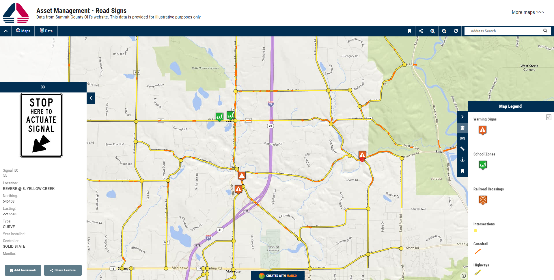
This map shows key assets in a county's road network, including alerts about hazards or work underway that might affect transport and logistics throughout the county, or assist emergency services in keeping abreast of road blockages and conditions that might affect access. At a glance, users can see hazards across the entire road network and easily understand whether those hazards affect them. Explore this map

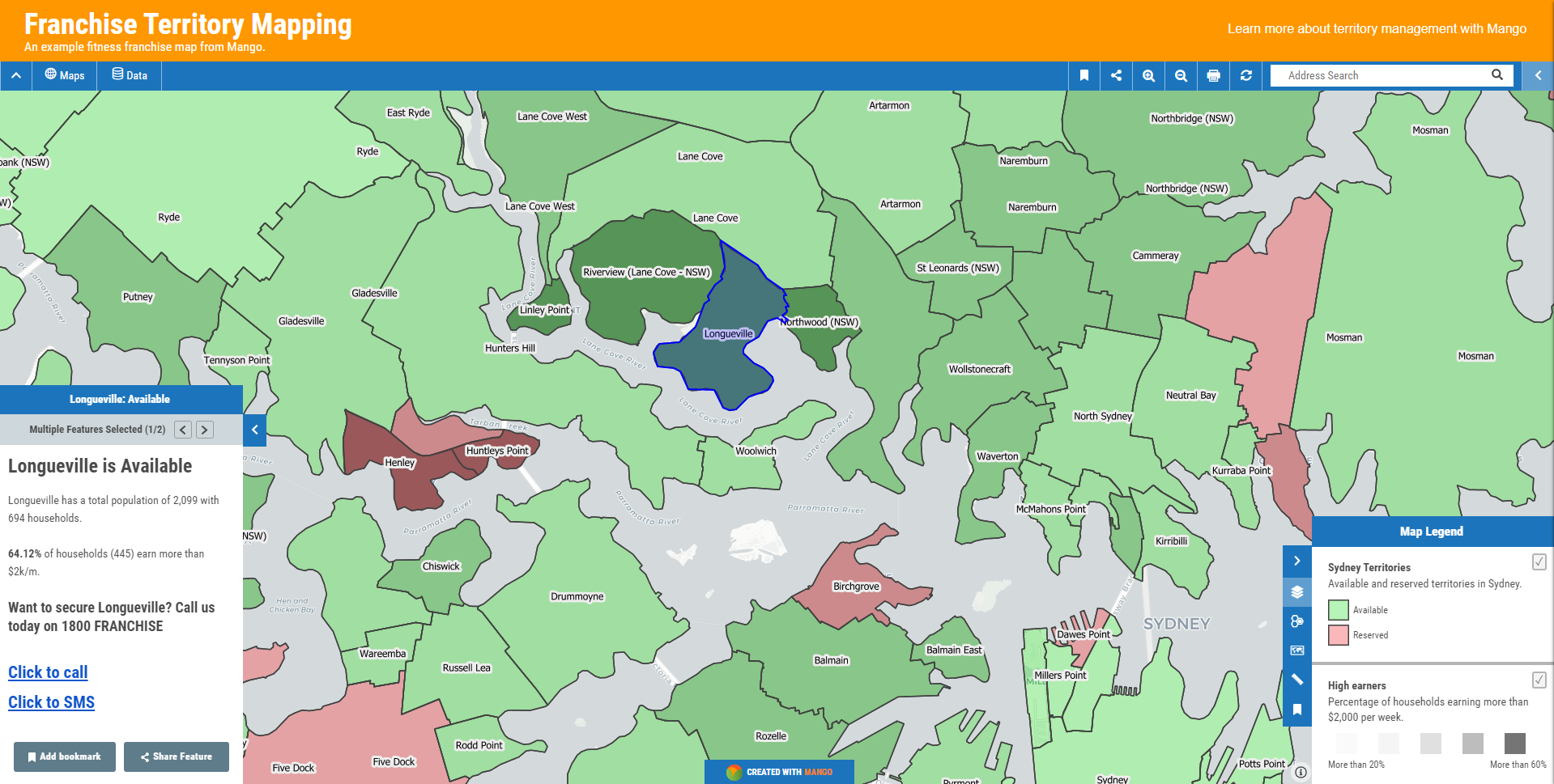
This is a map that displays sold and available territories with key household income data for each territory. Depending on your business size and growth strategy, a map or each key market could be displayed on individual maps, or a single map could contain all territories in your worldwide portfolio.
As part of a franchise sales pipeline, this map is a powerful sales tool that helps sales reps close deals by empowering prospects with data. The demographic data contained in each territory can be customised to suit any type of business or activity, and provides the prospect with an interactive visualisation to explore and evaluate the relative benefits of a range of territories to help make a better purchasing decision. Explore this map
Maps can help users answer complex spatial questions, such as, "Which properties are in a flood risk zone?"
This map would be especially useful to insurance brokers, residents, or emergency services. In this case, the map is publicly available to anyone. Explore this map
Or simpler questions that provide rapid insights about the world around us. Here we have an interactive productivity map that shows us the key crop production figures in California's bread basket counties. Explore this map
A map is what you make it.
A successful map is one that leads the user to make correct decisions that take him from his present location to a destination that fulfills his larger purpose.
In other words, the maps you make should provide you and your users with simple paths to the answers in your data.
Privacy of your data is baked in.
The datasets you upload to Mango and use to create visualisation layers are kept private. If you choose to, you can make these available — completely public, or restricted to groups of authorised users that you have explicitly granted access.
Make the map yours.
Each map can be completely customised to suit your business or workflow requirements. You choose the tools and visualisation overlays that you need to get work done. From looking up zip codes to find the closest technician to a customer, or letting field staff report their maintenance tasks, a map can do just about anything you might already do with spreadsheets and documents, but quicker and easier.